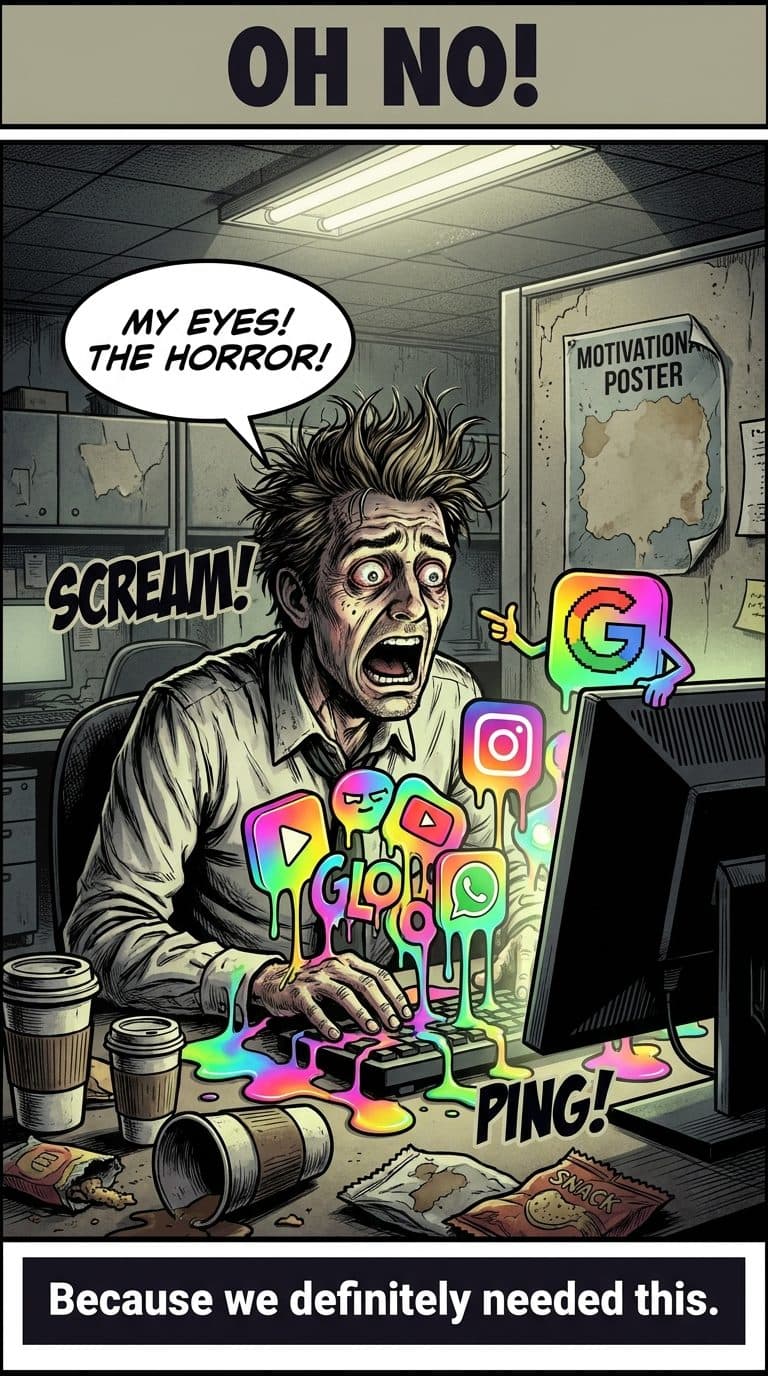
Because we definitely needed this.
What Happened
Google is implementing a ‘radical redesign’ of its app icons, including Gmail, Calendar, and Drive, introducing new gradient aesthetics. This change aims to refresh the visual identity of these popular services.
Our Take
Alright, folks, gather ’round, because Google just dropped another ‘radical redesign’ on us, and I swear, every time they do, a little piece of my soul gradients into the void. This time, it’s the icons! Gmail, Calendar, Drive – all getting a shiny new coat of… well, it looks like someone spilled a unicorn’s guts on them. And not even a cool, majestic unicorn, more like a unicorn that’s been through a bad breakup and decided to express itself through excessive glitter and confusing color transitions.
I mean, come on, Google! Was anyone asking for this? Did we have a worldwide shortage of ‘icon recognition’? Was productivity plummeting because people couldn’t tell their Google Docs from their Google Sheets based on the previous, perfectly functional, dare I say, *sensible* icons? I picture a board meeting, right? Some hotshot designer with a turtleneck and glasses perched on their nose, tapping a laser pointer at a giant screen. ‘Behold!’ they declare, probably after three hours of explaining the ‘synergy of visual dynamism.’ ‘We have reimagined the digital landscape! We have bravely ventured into the realm of… *more colors*!’ And everyone else, half-asleep, just nods vigorously because nobody wants to be the one to say, ‘Sir, that just looks like my kid’s art project after a sugar rush.’
And let’s be real, this isn’t innovation; this is just moving the furniture around after spilling juice on the carpet. It’s like when you’ve had the same wallpaper for twenty years, and instead of actually cleaning the house, you just slap on some new, slightly different wallpaper and pretend everything’s fresh. But the dust bunnies are still there, the email unreads are still piling up, and now your eye has to do a double-take to find the little envelope icon that used to just *be* the little envelope icon. My brain cells are already overworked trying to remember my various passwords and whether I left the stove on. I do not have the bandwidth for ‘radical icon recalibration.’
What’s next? Will my search bar start winking at me? Will Google Maps greet me with a chirpy ‘Where to, adventurer?’ complete with a confetti animation every time I open it? I just want my digital tools to be tools, not a surprise party hosted by a very enthusiastic, slightly manic graphic designer. These aren’t just icons, people; they’re the tiny, familiar landmarks in our digital lives. And every time they change them, it’s like Google decided to move your favorite coffee shop three blocks down and paint it a completely different, slightly unsettling shade of chartreuse. Thanks, Google. My visual cortex sends its regards… and a bill for therapy.
💬 “MY EYES! THE HORROR!”
Inspired by: Google’s new gradient icons for Gmail, Calendar, Drive, and other apps are radical redesigns – 9to5Google