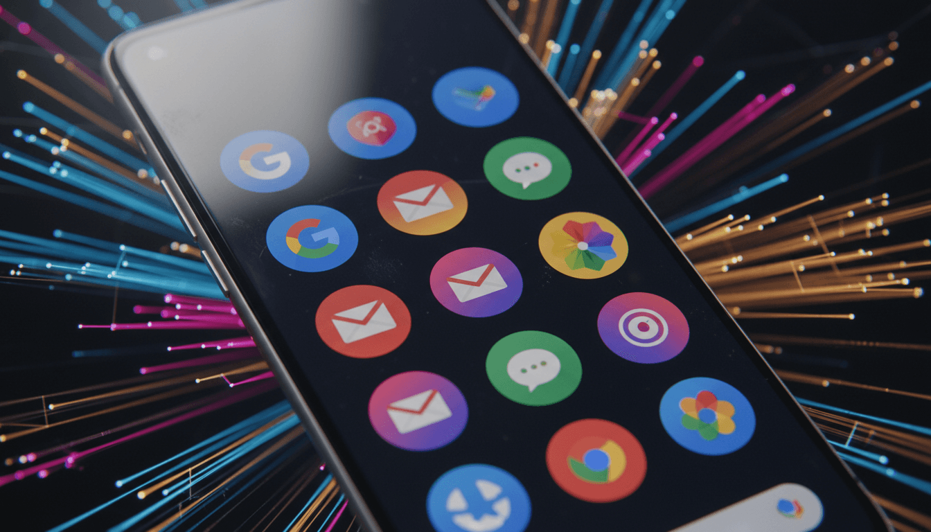
Google apps embrace gradient icon design, marking a significant visual overhaul across the tech giant’s ecosystem. Following an initial rollout in late 2025, it appears Google is extending its new aesthetic to the entirety of its application suite. Reports from 9to5Google, featuring leaked images, confirm a departure from the previously uniform circular icons, which often struggled to incorporate the full spectrum of Google’s iconic brand colours.
The shift to a gradient design signifies more than just a superficial change. It reflects Google’s continuous effort to refine its user interface and enhance brand consistency across diverse platforms. The uniform circles, while clean, sometimes felt restrictive, forcing designers to compress complex logos into tight confines. The new gradient approach offers greater flexibility, allowing for more dynamic and visually appealing representations of each app’s identity.
The Evolution of Google’s Visual Identity
Google’s design philosophy has always evolved, adapting to new technological capabilities and user expectations. From the early, somewhat basic logos to the Material Design principles that brought a sense of tactile reality to digital interfaces, each iteration aims for clarity and user-friendliness. This latest move towards gradients suggests a desire for a more fluid and modern look, potentially aligning with trends seen in other major tech players and contemporary design aesthetics.
“The new gradient icons offer a fresher, more dynamic visual language that better represents the diversity and innovation within Google’s product portfolio.”
This aesthetic update isn’t merely about visual appeal; it’s also about reinforcing brand recognition. As Google’s services become increasingly integrated into our daily lives, from search and email to maps and productivity tools, maintaining a cohesive and recognizable brand presence is paramount. The new icons aim to be instantly identifiable, regardless of the device or operating system a user is interacting with.
Anticipating the Full Rollout and User Reception
While the initial rollout began in late 2025, the widespread adoption of the new gradient icons across all Google apps is still in progress. Users can expect to see these updated visuals appear incrementally on their devices, likely tied to app updates pushed through the Google Play Store and Apple App Store. The transition will be a gradual one, ensuring a smooth experience for millions of users worldwide.
The reception to design changes in widely used applications can often be mixed. Some users embrace novelty, while others prefer the familiarity of existing interfaces. However, given Google’s extensive user testing and meticulous design processes, it’s likely that the new gradient icons have been carefully considered to ensure broad appeal and improved usability. This refresh is a strategic move to keep Google’s digital presence feeling contemporary and engaging, reinforcing its position at the forefront of the tech industry. For more information on tech developments, visit our related Tech news section.
Ultimately, the move to a gradient icon design represents Google’s ongoing commitment to refining its user experience and maintaining a visually compelling brand. By shedding the constraints of uniform circles, Google is embracing a more modern and flexible design language that promises to keep its vast array of applications looking fresh and intuitive for the foreseeable future.